

Rate History
compasslabs.ai/rates shows what DeFi actually paid: a year of weekly stablecoin yield, borrow costs, RWA returns and the leverage those rates support, across Aave and Morpho on Ethereum, Arbitrum and Base. It’s built from the same on-chain data the API reads, sampled weekly. Pick a range (12, 26 or 52 weeks), a stablecoin (USDC or USDT) and a chain, then compare the best average APY, the spread between venues, volatility and withdrawable depth.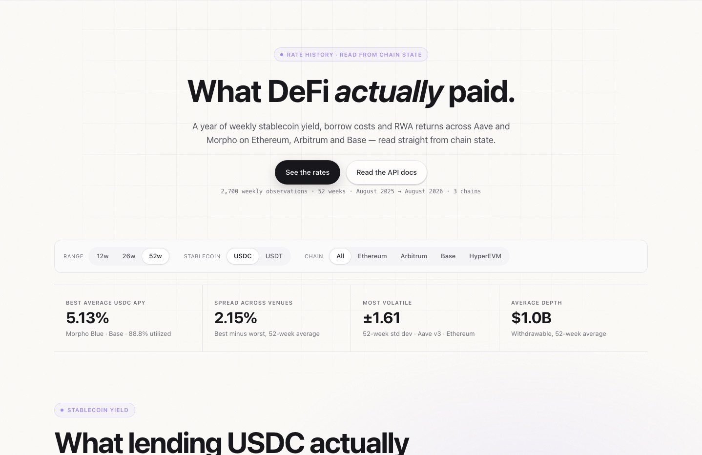
Rate History: a year of weekly rates
Risk Dashboard
compasslabs.ai/risk shows the risk behind the yield. It traces every dollar in the major vaults back to the Morpho markets, Aave reserves and Pendle PTs underneath, on Base, Ethereum and Arbitrum, so you can see how concentrated the capital really is. It includes a Sankey of where vault deposits go, correlation between venues, leverage, a cascade stress test, risk-adjusted yield and vault economics. It reads live from the market data endpoints you can call yourself.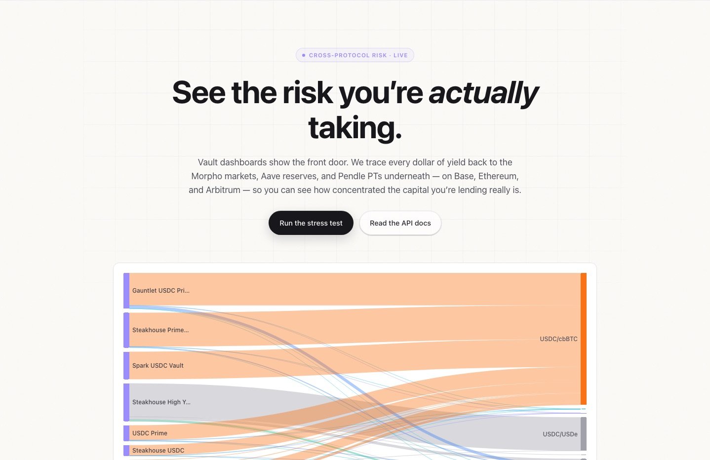
Risk Dashboard: where vault deposits actually go